- from kyoto
PHOTOGRAPHY :: GRAPHIC DESIGN
Here is a brief I have created. The client is called from kyoto and WHub:
.jpg)


THE PROCESS
i first began with looking at different zines, getting an idea on different layouts and styles.
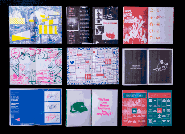
I decided to look for more alternative, indie, and experimental looks because WHUB specified that from kyoto wanted this zine to be an act of rebellion from the corporate modern world. I interpreted this to mean from kyoto wanted a zine that was more catered toward a specific audience and would be more specialised and different.


My clients agreed that it would be preferable and more convenient for them to use the preexisting photographs of Kyoto that I took on a previous trip. Because of this, I compiled my photos into contact sheets and sent them to my client so they could decide which photos they wanted to include in their final product
PHOTOS


BEFORE AND AFTER


I then created the title page for two different styles the zine's aesthetic could take on.
After conferring with my client, we decided that the darker blue would fit the direction and brand from kyoto wanted to present to their audience.


The client and I met together and created a finalised colour palette I would use to create the final zine.
I also gave a number of different options of fonts for the from kyoto logo. Together we conferred and agreed that we felt the font 'DK Scrawny Cat was the most appropriate for the from kyoto aesthetic. due to its more handwritten and scratchy look.


